Jess Webberley
/Jess Webberley is a final year BA Illustration student at BCU. She has designed the new GAF logo. As part of the relaunch for GAF I wanted to feature Jess's work and for her to explain to you what inspires her and what GAF means to her. Jo Berry
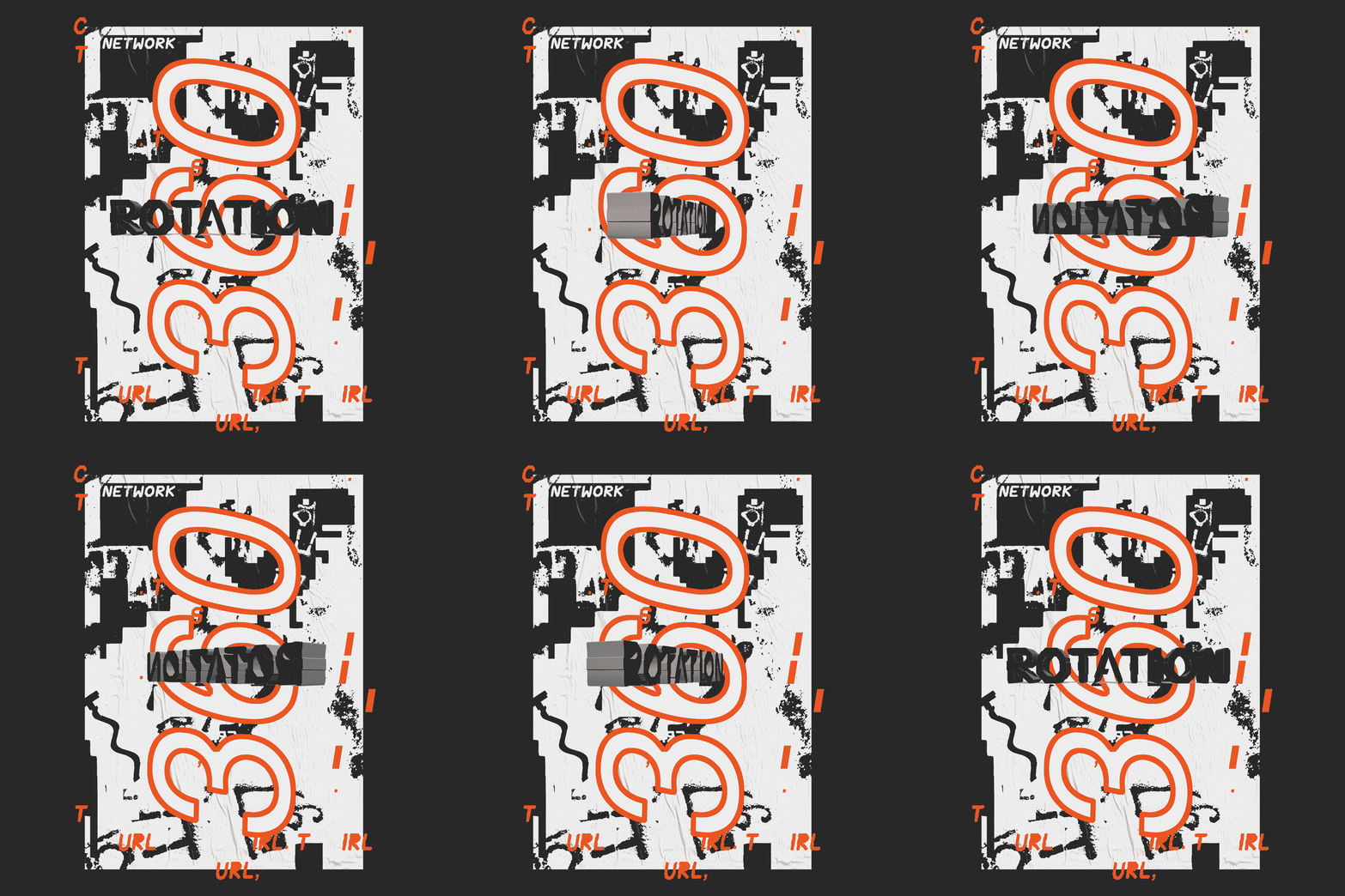
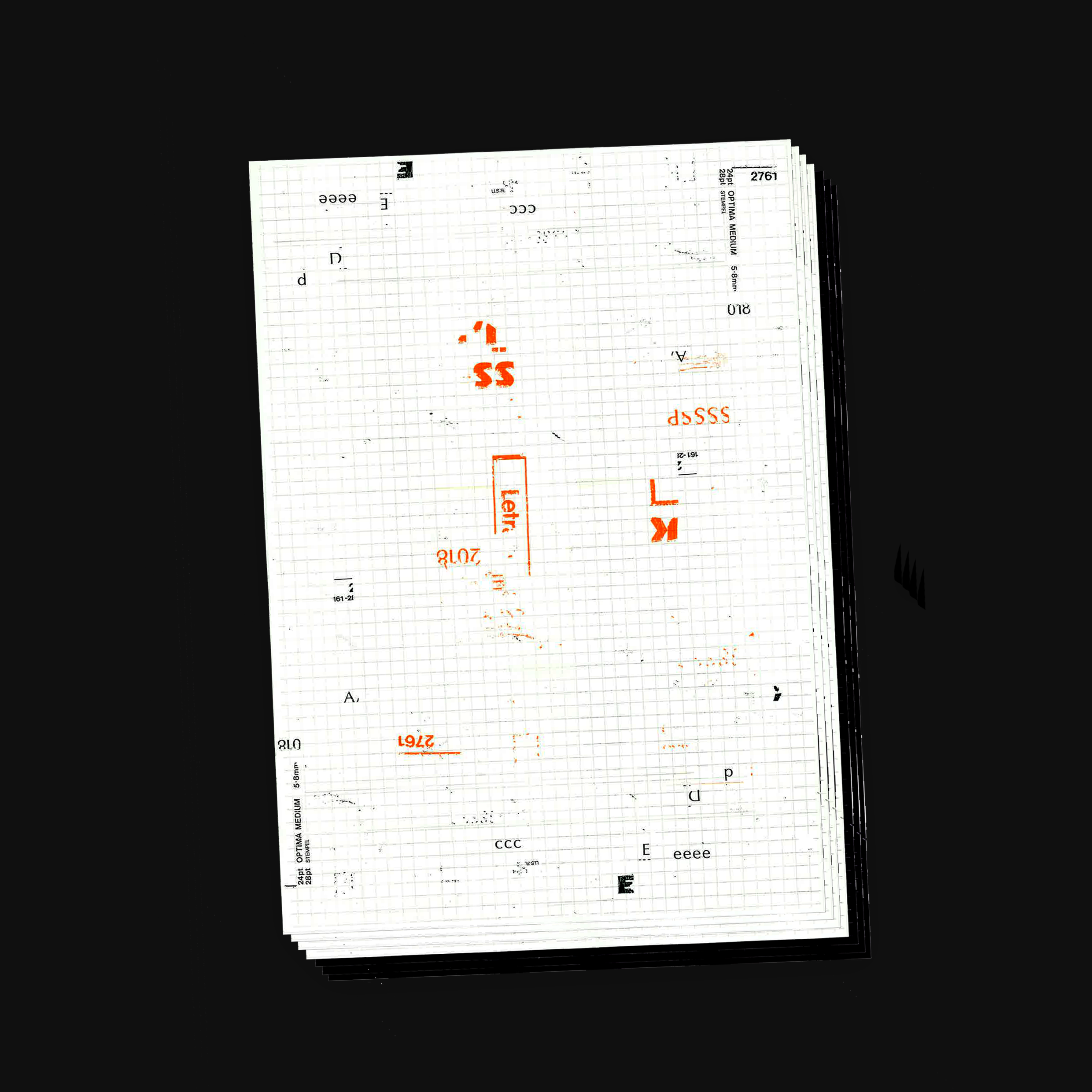
My work explores the virtual reality that we call cyberspace, and its connection to the physical reality that we find ourselves living in. Within my practice I capture a sense of interchangeability between the physical and digital world, whilst being inspired and influenced by the urban environment. Through creating experimental publications which encapsulate the crossover of physical and digital mediums I hope to communicate that the URL and the IRL exist in symbiosis; we live in a time where one cannot hope to function without the other. I question the physicality of the internet - the internet is enabled by physical materials. Through exploring this subject I have created my own typeface, and have most recently began writing code to create an experimental website which I hope will be the anti-matter to my physical publications.
WHAT GAF MEANS TO ME To me GAF bridges the gap between practice and theory; it shows that there should be no gap. Within my practice theory is key, much of the work I produce has been informed by research. GAF provides the opportunity to hear from experienced practitioners, and has a sense of community which to me is very valuable. GAF celebrates the hi tech, low tech and the no tech; a theme which is prominent within my practice. I believe that work in all mediums should be celebrated, be they digital or analogue. The crossover of the digital and the analogue is something I always consider and utilise within my work - for this reason GAF stands for ideals that I can strongly resonate with.
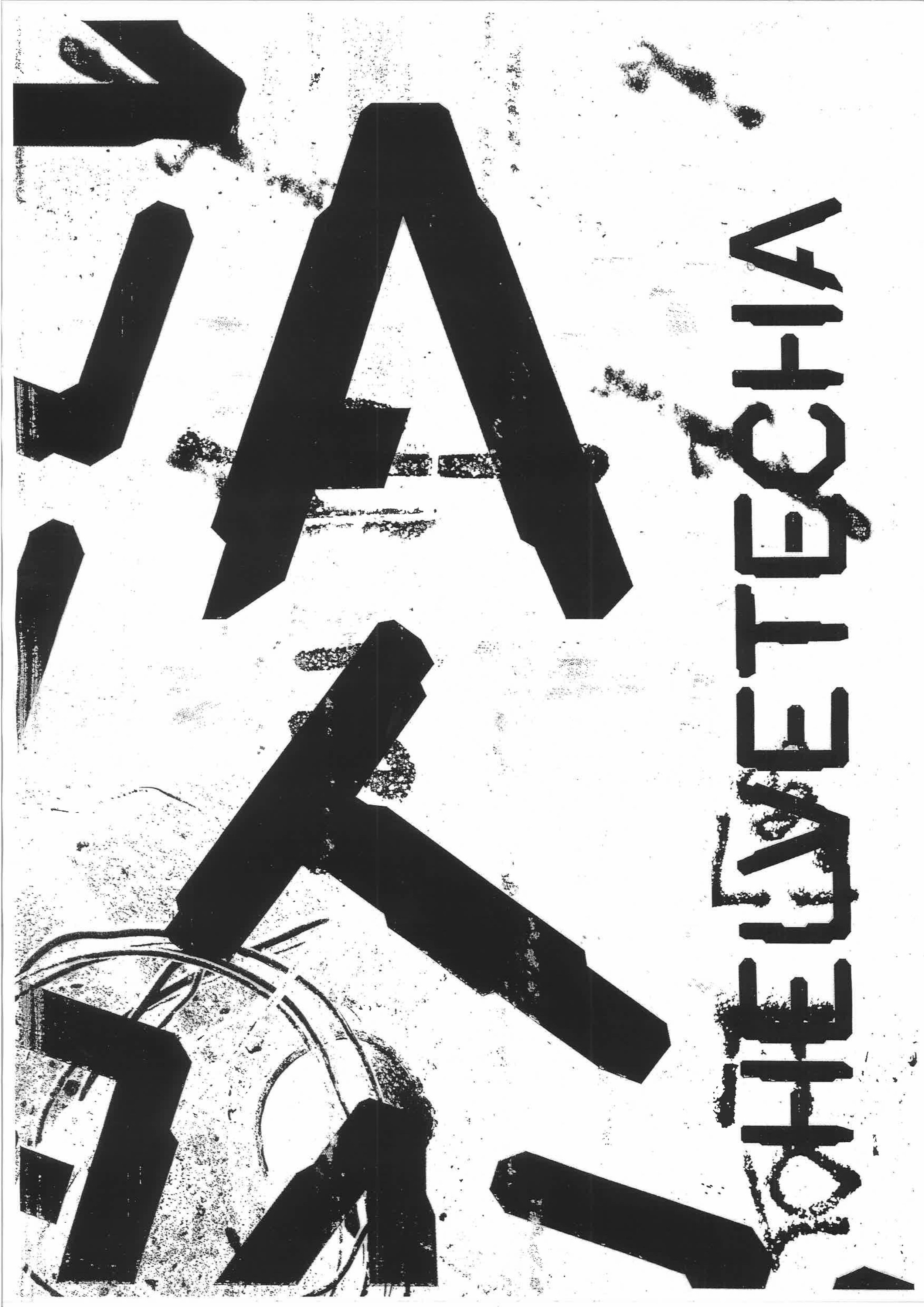
IDEA BEHIND LOGO I designed the GAF logo with the idea of theory informing practice in mind. The letterforms I produced for the logo are inspired by ‘urban hieroglyphics’ - a recurring theme within my projects. The theory of these is that they are physical markings within the urban environment representing internet cables and this has informed my practice. I thought that using these markings as a starting point for the GAF logo would be fitting.


